All widgets include a Background Properties tab in the settings. The background properties allow you to configure the appearance of a widget container's background.
Watch the video below for a quick overview of the background properties for widgets, and read below for more detailed instructions and information on configuring these settings.
To configure the background properties of a widget:
- Mouse over the widget.
The widget's controls will be displayed.
- Click on the down arrow beside the widget icon.
- Choose the Settings item from the drop-down menu.

The widget Settings popup will be displayed.

- Click on the Background Properties tab.
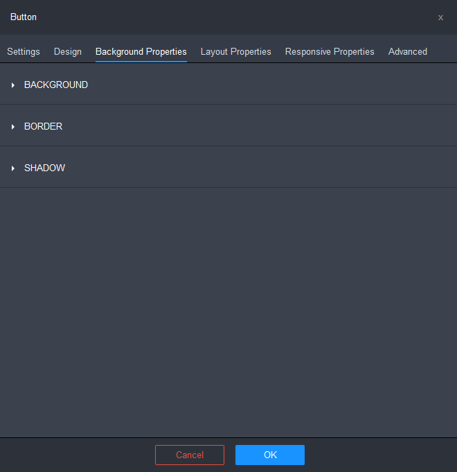
- Configure the settings as required.
The Background Properties tab is organized into 3 groups.
BACKGROUND
You can specify background fill properties for the widget container in its normal state.
You can also specify alternate background fill properties for the widget container in its hover (mouse-over) state.
Normal
- Click on the BACKGROUND row to expand the section.
The Normal tab is selected by default.
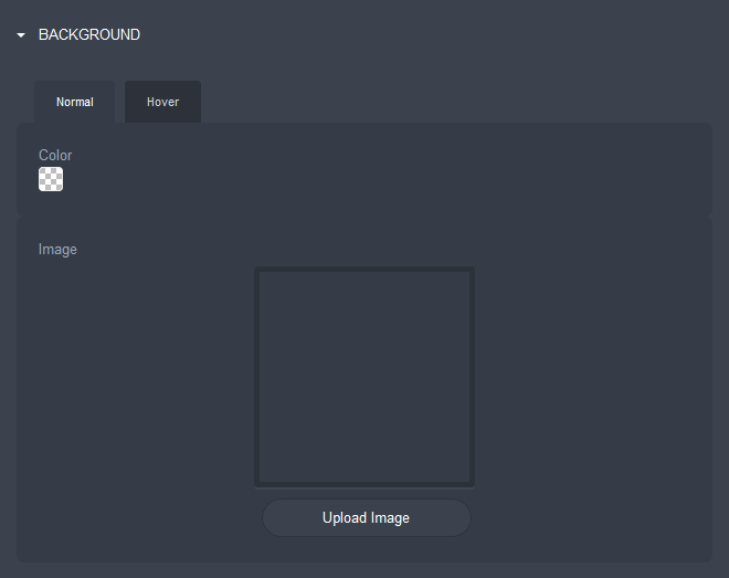
- Click on the Color box to specify a background color for the normal state using the Color popup. Click here for more detailed instructions.
- Click on the Upload Image button to upload a background image for the normal state.
- Configure the Normal state settings for the image.
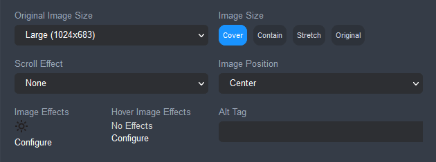
- Original Image Size: lets you choose a size option for rescaling the original size of the image.
- Scroll Effect: lets you set the speed and direction of the image on your webpage while it is being scrolled.
- None: no effect is applied.
- Fixed: the image stays in place while the foreground content scrolls.
- Parallax - Very Slow: the image moves at a very slow speed compared to the foreground content while scrolling.
- Parallax - Slow: the image moves at a very slow speed compared to the foreground content while scrolling.
- Parallax - Minimal: the image moves at a slightly slower speed compared to the foreground content while scrolling.
- Image Effects: click on the Edit link to apply filter and transform effects to the image.
- Hover Image Effects: (only available if no image is selected in the Hover tab). Click on the Edit link to apply filter effects, transform effects, and hover animation to the image for the hover state.
Click here for instructions on how to add image effects.
- Image Size: lets you set the size of the image in relation to its container.
- Cover: scales the image to cover the entire container whilst maintaining the aspect ratio. One of the edges may be cropped if the image width or height becomes too big for the container.
- Contain: scales the image so that each side is as large as possible while not exceeding the length of the corresponding side of the container.
- Stretch: stretches or shrinks the image to fill the container ignoring the original aspect ratio.
- Original: keeps the image at the size specified in the Original image size field.
- Image Position: lets you specify the position of the image in relation to its container.
Hover
- Optionally, click on the Hover tab to specify the background properties for the hover state.
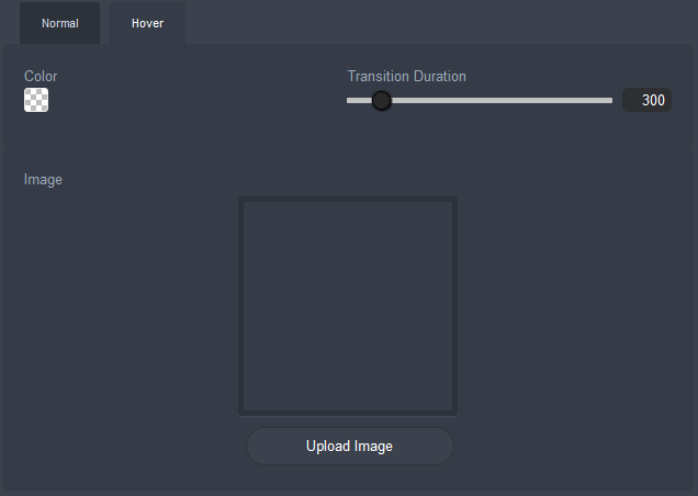
- Click on the Color box to specify a background color for the normal state using the Color popup. Click here for more detailed instructions.
- Specify the Transition Duration.
- Click on the Upload Image button to upload a background image for the normal state.
- Configure the settings for the image.
- Original Image Size: lets you choose a size option for rescaling the original size of the image.
- Scroll Effect: lets you set the speed and direction of the image on your webpage while it is being scrolled.
- None: no effect is applied.
- Fixed: the image stays in place while the foreground content scrolls.
- Parallax - Very Slow: the image moves at a very slow speed compared to the foreground content while scrolling.
- Parallax - Slow: the image moves at a very slow speed compared to the foreground content while scrolling.
- Parallax - Minimal: the image moves at a slightly slower speed compared to the foreground content while scrolling.
- Hover Image Effects: lets you apply filter effects, transform effects, and hover animation to the image for the hover state.
Click here for instructions on how to add hover image effects.
- Image Size: lets you set the size of the image in relation to its container.
- Cover: scales the image to cover the entire container whilst maintaining the aspect ratio. One of the edges may be cropped if the image width or height becomes too big for the container.
- Contain: scales the image so that each side is as large as possible while not exceeding the length of the corresponding side of the container.
- Stretch: stretches or shrinks the image to fill the container ignoring the original aspect ratio.
- Original: keeps the image at the size specified in the Original image size field.
- Image Position: lets you specify the position of the image in relation to its container.
- Alt Tag: lets you specify a text alternative for the image. This is useful for describing theimage to those who cannot see and can positively impact your store's search engine rankings.
BORDER
- Click on the BORDER row to expand the section.

You can specify border properties for the widget container in its normal state.
You can also specify alternate border properties for the widget container in its hover (mouse-over) state.
- Specify the properties for the widget container's border for the normal state.
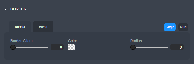
- Border Width: the line thickness of the widget container's border, specified in pixels. Use the slider or enter a value between 0 and 100 into the field beside the slider.
- Color: the color of the widget container's border. Click on the Color box to edit the border color using the Color popup. Click here for more detailed instructions.
- Radius: this lets you specify a value in pixels to determine how round the border corners are. Use the slider or enter a value between 0 and 100 into the field beside the slider.
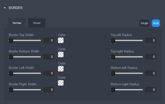
- Single/Multi: these toggle buttons let you choose the border style:
- Single: lets you set consistent border properties for all sides of the widget container.
- Multi: lets you set different border properties for each of the four sides of the widget container.
- Single: lets you set consistent border properties for all sides of the widget container.
- Optionally, click on the Hover tab to specify the properties for the widget container's border for the hover state. Instructions are the same as for the normal state.
SHADOW
- Click on the SHADOW row to expand the section.
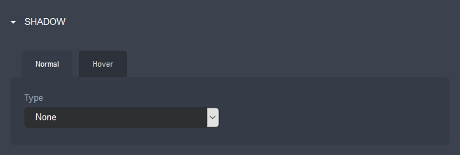
You can specify shadow properties for the widget container in its normal state.
You can also specify alternate shadow properties for the widget container in its hover (mouse-over) state.
- Specify the widget container's shadow Type for the normal state.
- None: no shadow is displayed.
- On: displays a shadow using system default settings around the widget container.
- Custom: lets you configure a custom shadow.
- Color: sets the color of the shadow. Click on the Color box to edit the shadow color using the Color popup. Click here for more detailed instructions.
- Size sets the size of the shadow width in pixels. Use the slider or enter a value between 0 and 20 into the field beside the slider.
- Angle: sets the angle of the shadow in reference to the widget container. Use the slider or enter a value between 0 and 360 degrees into the field beside the slider.
- Effect: sets the location of the shadow.
- Outset: displays the shadow outside of the widget container border.
- Inset: displays the shadow inside of the widget container border.
- Blur: sets the spread distance of the shadow in pixels. Use the slider or enter a value between 0 and 20 into the field beside the slider. The shadow will be sharp if set to 0. The higher the number, the more blurred it will be, and the further out the shadow will extend.
- Distance: sets the distance in pixels of the shadow from the edge of the widget container, both in the horizontal and vertical direction. Use the slider or enter a value between 0 and 20 into the field beside the slider.
- Optionally, click on the Hover tab to specify the widget container's shadow Type for the hover state. Instructions are the same as for the normal state.
- Click on the BACKGROUND row to expand the section.
- Click OK, once you have finished configuring the settings.
- Click on the Save button and then click on the Publish button at the right of the Page Settings Bar.
Comments
0 comments
Please sign in to leave a comment.