
Graphic design properties refer to the various visual and stylistic objects that are used to manipulate images to create visually appealing and effective designs. These properties encompass a range of factors that contribute to the overall aesthetics, communication, and functionality of designs in the template Builder. This guide explains each of the properties and how to adjust them.
Prerequisites
- You must have administrator access to use this feature
To adjust the properties of designs in the Template Builder:
- Log into your DecoNetwork Website.
- Browse to Admin > Stock Designs.

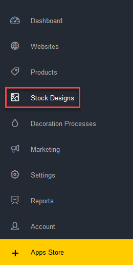
- Select Stock Designs List.
- Click the Add Design button in the Breadcrumb & Action bar and click Create Template from the drop-down menu.
The Template Builder app is loaded in the window.
- Add an image to the design canvas.
See the article Add a design in the Template Builder for instructions on how to add an image.
- Select the design object you wish to adjust the properties of by:
- Clicking on the design object in the design canvas.
- Clicking on the design object in the Layers list at the top of the Arrange panel.
The Layer Properties for the design will appear in the Properties panel on the right side of the Template Builder.
- Configure the design properties as required:
-
POSITION: lets you move the selected design within the design canvas from any of the eight extent points.
- X: the distance that the top left corner of the design container is offset along the X-axis from the top left corner of the design canvas.
- Y: the distance that the top left corner of the design container is offset along the Y-axis from the top left corner of the design canvas.
-
SIZE: lets you resize the selected design by specifying the dimensions of its container.
- W: the width of the design container.
- H: the height of the design container.
- Aspect Ratio: lets you choose whether to maintain the proportional ratio of the design object when it is resized. When the chain icon is linked, the aspect ratio will be maintained. When the chain icon is unlinked, the original aspect ratio will be ignored.
- ROTATE: lets you turn the selected design around its center axis by specifying a specific angle at which to rotate the design.
-
REFLECT: lets you mirror the selected design.
- Mirror Horizontally: lets you flip the design object from left to right.
- Mirror Vertically: lets you flip the design object from top to bottom.
-
HORIZ. ALIGN: lets you mirror the selected design object.
- Align Left: lets you align the selected design to the left edge of the design canvas.
- Align Horizontal Center: lets you align the selected design to the horizontal center of the design canvas.
- Align Right: lets you align the selected design to the right edge of the design canvas.
-
VERT. ALIGN: lets you mirror the selected design.
- Align Top: lets you align the selected design to the top edge of the design canvas.
- Align Vertical Center: lets you align the selected design to the vertical center of the design canvas.
- Align Bottom: lets you align the selected design to the bottom edge of the design canvas.
- COLORS: lets you change the colors used in an SVG image.
Customization Options
- Allow editing?: tick this checkbox if you want to allow customers to change the appearance of the selected design object.
- Allow replace?: tick this checkbox if you want to allow customers to replace the selected design.
- Allow clear?: tick this checkbox if you want to allow customers to remove the selected design entirely.
- Can change color?: tick this checkbox if you want to allow customers to change the colors of the selected design object.
-
POSITION: lets you move the selected design within the design canvas from any of the eight extent points.
- Click on Save & Edit in the Title Bar when done.
Comments
0 comments
Please sign in to leave a comment.