
The Search Widget lets you add a Search field to your website page. Watch the video below for a quick overview of how to use the Search Widget, and read below for more detailed instructions and for information on settings.
To add a Search Widget to your website:
- Click on the WIDGETS button in the Website Editor Toolbar.
- Browse the Widgets tab to locate the Search Widget in the BASICS section.
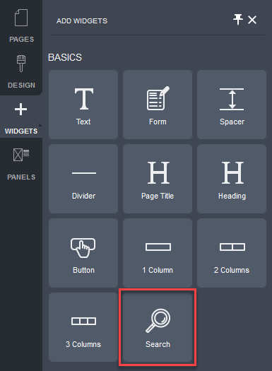
- Click and drag the Search Widget onto your website page.
Allowable areas the Search Widget can be inserted into include:
- Within rows
- Within columns
- Above or below existing widgets
- Between existing widgets
The Search Settings popup will be displayed.
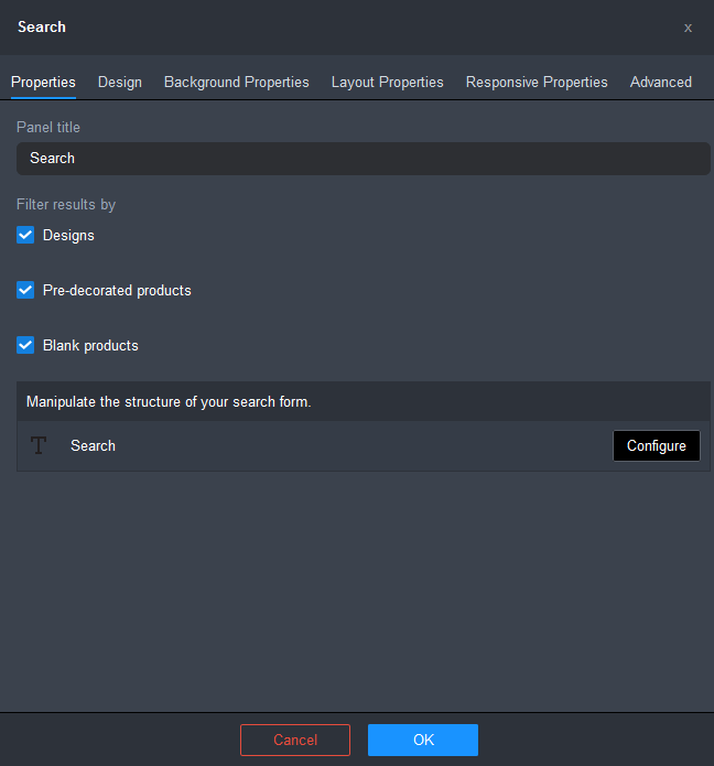
- Modify the settings for the Search Properties.
- Enter a name for the Search panel in the Panel Title field.
- Choose the categories that you want the search results to be filtered by:
- Designs: tick this checkbox if you want designs to be returned in the search results.
- Pre-decorated products: tick this checkbox if you want pe-decorated products to be returned in the search results.
- Blank products: tick this checkbox if you want blank products to be returned in the search results.
- Click Configure to configure the properties for the search field.
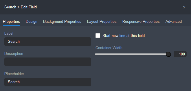
- Label: the title of the field.
- Description: lets you enter a description to explain to your website visitors how to complete the field.
- Placeholder: lets you enter a particular value to be used to pre-populate the field.
- Start a new line at this field: tick this checkbox to display this field on a new line.
- Container Width: lets you set the width of the field's container as a percentage of the width of the container in which it is located. You can use the slider or enter a percentage value into the Container Width field.
- Click OK to save the changes.
- Click on the Save button and then click on the Publish button at the right of the Page Settings Bar.
To edit the Design settings for the Search Widget:
- Mouse over the widget.
The widget's controls will be displayed.
- Click on the down arrow beside the Search Widget icon.
- Choose the Search Settings item from the drop-down menu.

The Search Settings popup will be displayed.
- Click on the Design tab.

- Select from one of the pre-configured Search Layout options.
- Configure the rest of the design options for the Search field.
- Heading: lets you edit the font style and the color of the heading used for the Search field.
- Click on the font name to edit the font style using the Font popup. Click here for instructions.
- Click on the color spot to edit the text color using the Color popup. Click here for instructions.
- Label: lets you edit the font style and the color of the label used for the Search field.
- Click on the font name to edit the font style using the Font popup. Click here for instructions.
- Click on the color spot to edit the text color using the Color popup. Click here for instructions.
- Input: lets you configure the style of the Search input field. Click here for instructions.
- Button: lets you configure the style of the Search command button. Click here for instructions.
- Heading: lets you edit the font style and the color of the heading used for the Search field.
- Click OK, once you have finished configuring the settings.
- Click on the Save button and then click on the Publish button at the right of the Page Settings Bar.
To configure the style of the search input field:
- Click on the input field.

The Input Field Settings popup will be displayed
- Configure the settings for the input field.
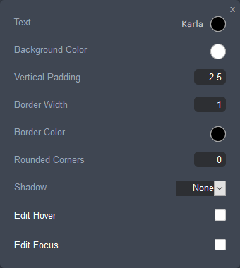
- Text: lets you edit the font style and the color of text used in the input field.
- Click on the font name to edit the font style using the Font Popup. Click here for instructions.
- Click on the color spot to edit the text color using the Color popup. Click here for instructions.
- Background Color: sets the fill color of the input field. Click on the color spot to edit the button background color using the Color popup. Click here for instructions.
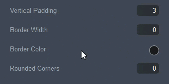
- Vertical Padding: sets the height of the input box, using the em unit of measurement. An em is a value relative to the size of the current font. Enter a value between 0.6 and 6. For example, 2em means 2 times the size of the current font.
- Border Width: the line thickness of the input field's border, specified in pixels. Enter a value between 0 and 20.
- Border Color: the color of the input field's border. Click on the color spot to edit the border color using the Color popup. Click here for instructions.
- Rounded Corners: this lets you specify a radius value in pixels to determine how round the border corners are. Enter a value between 0 and 50.
- Shadow: sets the appearance of the shadow, if any, added to the input field.
- None: No shadow is displayed.
- On: Adds a consistent shadow around the entire border of the input field.
- Custom: Lets you configure a custom shadow. Click here for instructions on how to configure a custom shadow.
- Edit Hover: lets you configure the appearance of the input field when you move the mouse over it. Click here for instructions on how to configure the hover appearance.
- Edit Focus: lets you configure the appearance of the input field when it is in focus. Click here for instructions on how to configure the focus appearance.
For the Vertical Padding, Border Width, Border Color and Rounded Corners properties, you can use the slider to configure the setting.
The slider will appear when you hover your mouse anywhere along the line between the label and the input field of the property.
- Text: lets you edit the font style and the color of text used in the input field.
- Click the cross in the top right of the input field settings popup dialog box to close it.
- Click on the Save button and then click on the Publish button at the right of the Page Settings Bar.
To configure the style of the search command button:
- Click on the button.
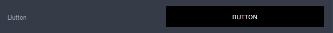
The Button Style Settings popup will be displayed
- Configure the settings for the selected button type.
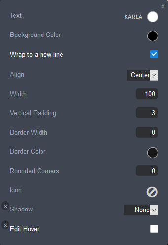
- Text: lets you edit the font style and the color of text used in the Search button.
- Click on the font name to edit the font style using the Font Popup. Click here for instructions.
- Click on the color spot to edit the text color using the Color popup. Click here for instructions.
- Background Color: sets the fill color of the Search button. Click on the color spot to edit the button background color using the Color popup. Click here for instructions.
- Wrap to a new line: lets you choose whether you want the Search button to always display on a separate line. Tick the checkbox to display the Search button on a new line.
- Align: this field is displayed when the Wrap to a new line checkbox is ticked. It allows you to choose how the Search button is aligned with the Search input field: Left, Center or Right.
- Width: lets you specify the width of the Search button as a percentage of the width of the container it is located in.
- Vertical Padding: sets the height of the Search button, using the em unit of measurement. An em is a value relative to the size of the current font. Enter a value between 0.6 and 6. For example, 2em means 2 times the size of the current font.
- Border Width: the line thickness of the Search button's border, specified in pixels. Enter a value between 0 and 20.
- Border Color: the color of the Search button's border. Click on the color spot to edit the border color using the Color popup. Click here for instructions.
- Rounded Corners: this lets you specify a radius value in pixels to determine how round the border corners are. Enter a value between 0 and 50.
- Icon: lets you add an icon to the Search button.
- Shadow: sets the appearance of the shadow, if any, added to the Search button.
- None: No shadow is displayed.
- On: Adds a consistent shadow around the entire border of the button.
- Custom: Lets you configure a custom shadow. Click here for instructions on how to configure a custom shadow.
- Edit Hover: lets you configure the appearance of the Search button when you move the mouse over it. Click here for instructions on how to configure the hover appearance.
For the Horizontal Padding, Vertical Padding, Border Width, Rounded Corners and Hover Transition Duration properties, you can use the slider to configure the setting.
The slider will appear when you hover your mouse anywhere along the line between the label and the input field of the property.
- Text: lets you edit the font style and the color of text used in the Search button.
- Click the cross in the top-right of the button style popup dialog box to close it.
- Click on the Save button and then click on the Publish button at the right of the Page Settings Bar.
To configure a custom shadow:
- Select Custom from the Shadow dropdown list.
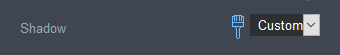
- Click on the brush icon that appears at the left of the Shadow drop-down box.
The Shadow Settings popup is displayed.
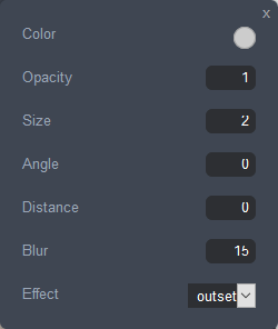
- Configure the settings for the shadow.
- Color: sets the color of the shadow. Click on the color spot to change the shadow color using the Color Popup. Click here for instructions.
- Opacity: sets the transparency level of the shadow. Enter a value between 0.00 and 1, where 1 is not transparent at all, 0.5 is 50% see-through, and 0 is completely transparent.
- Size: sets the size of the shadow width in pixels. Enter a value between 0 and 20.
- Angle: sets the angle of the shadow in reference to the button. Enter a value between -180 and 180 degrees.
- Distance: sets the distance in pixels of the shadow from the button both in the horizontal and vertical direction. Enter a value between 1 and 10.
- Blur: sets the spread distance of the shadow in pixels. Enter a value between 0 and 20. The shadow will be sharp if set to 0. The higher the number, the more blurred it will be, and the further out the shadow will extend.
- Effect: sets the location of the shadow.
- Outset: displays the shadow outside of the button border.
- Inset: displays the shadow inside of the button border.
For the Opacity, Size, Angle, Distance and Blur properties, you can use the slider to configure the setting.

The slider will appear when you hover your mouse anywhere along the line between the label and the input field of the property.
- Click the cross in the top-right of the shadow style popup dialog box to close it.
- Click the cross in the top-right of the settings popup dialog box to close it.
- Click on the Save button and then click on the Publish button at the right of the Page Settings Bar.
To configure the hover appearance for the input field/search button:
- Tick the Edit Hover checkbox.
The hover settings are displayed.
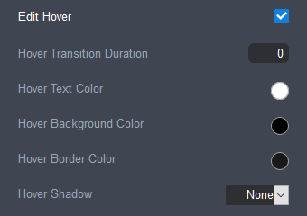
- Configure the settings for the hover appearance.
- Hover Transition Duration: sets the length of time, in milliseconds, over which the hover properties will occur. Enter a value between 0 and 2000.
- Hover Text Color: sets the color of the element's text on hover.
- Hover Background Color: set the element's background color on hover.
- Hover Border Color: set the element's border color on hover.
- Hover Shadow: sets the appearance of the shadow on hover added to the button, if any.
- None: No shadow is displayed.
- On: Adds a consistent shadow around the entire border of the element.
- Custom: Lets you configure a custom shadow. Click here for instructions on how to configure a custom shadow.
For the Hover Transition Duration property, you can use the slider to configure the setting.
The slider will appear when you hover your mouse anywhere along the line between the label and the input field of the property.
- Click the cross in the top-right of the settings popup dialog box to close it.
- Click on the Save button and then click on the Publish button at the right of the Page Settings Bar.
To configure the focus appearance for the input field:
- Tick the Edit Focus checkbox.
The focus settings are displayed.
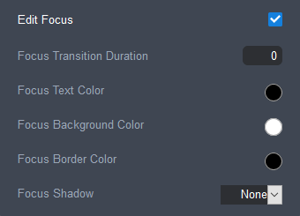
- Configure the settings for the focus appearance.
- Focus Transition Duration: sets the length of time, in milliseconds, over which the focus properties will occur. Enter a value between 0 and 2000.
- Focus Text Color: sets the color of the element's text, on focus.
- Focus Background Color: set the element's background color, when it is in focus.
- Focus Border Color: set the element's border color on focus.
- Focus Shadow: sets the appearance of the shadow on focus added to the button, if any.
- None: No shadow is displayed.
- On: Adds a consistent shadow around the entire border of the element.
- Custom: Lets you configure a custom shadow. Click here for instructions on how to configure a custom shadow.
For the Focus Transition Duration property, you can use the slider to configure the setting.
The slider will appear when you hover your mouse anywhere along the line between the label and the input field of the property.
- Click the cross in the top-right of the settings popup dialog box to close it.
- Click on the Save button and then click on the Publish button at the right of the Page Settings Bar.
Still have questions? Use the Search Tool at the top of the page to find more related guides. Need help? Click the icon to submit a support ticket – our Client Services team is ready to assist!
Comments
0 comments
Please sign in to leave a comment.