The Slider Widget allows you to add a slideshow to your website. Sliders are useful for showcasing the range of products and services that you offer and for bringing attention to important content on your website. Read below for detailed instructions for adding a slider to your website and for information on settings.
In this article, you will learn how...
- To add a Slider Widget to your website
- To add an image to a slide
- To set a slider height to automatically adjust to the content
- To change the background color of a slide
- To configure the Design settings for a Slider Widget
To add a Slider Widget to your website:
- Click on the WIDGETS button in the Website Editor Toolbar.
- Browse the Widgets tab to locate the Slider Widget you want in the MEDIA section.
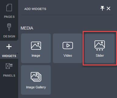
- Click and drag the Slider Widget onto your website page.
Allowable areas a Slider Widget can be inserted into include:
- Within rows
- Within columns
- Above or below existing widgets
- Between existing widgets
The Slider Settings popup will be displayed.
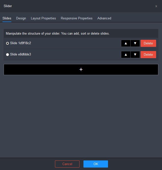
By default, the slider will contain 2 slides.
- Configure the structure of your slider.
- You can sort the order of the slides using the ▲ and ▼ icons.
- You can delete slides by clicking on the Delete button for the slide you want to delete.
- You can add slides by clicking on the + button.
- Add images to the slider. Click here for instructions.
- Configure the Design settings for the Image Widget. Click here for instructions.
- Click OK to apply the changes.
- Click on the Save button and then click on the Publish button at the right of the Page Settings Bar.
To add an image to a slide:
- Choose the slide you want to add an image to using one of the following:
- slide selector control at the top right of the slider widget
- scroll arrows at the sides of the slider widget
- slide selector buttons at the bottom of the slider widget
- Mouse over the Slider Widget.
The widget's controls will be displayed.
- Click on the down arrow beside the slide selector control.
- Choose the Background Image item from the drop-down menu.
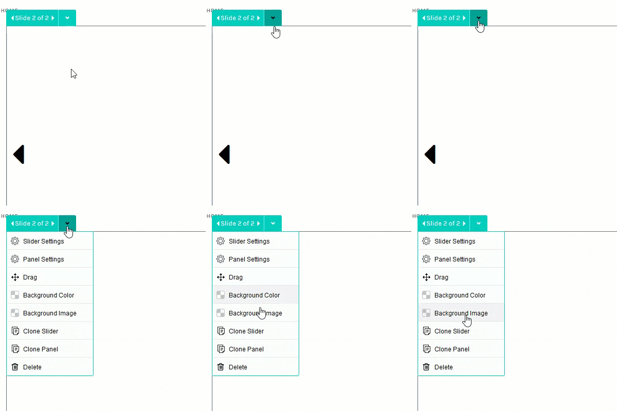
The Select Image popup will be displayed.

You can choose an image from one of 4 sources:
- Your Images: your own uploaded images.
- Theme Images: images provided with your selected theme.
- Stock Images: DecoNetwork stock images.
- Search The Web: search for free images (covered by a creative commons license) from image suppliers, Unsplash and Flickr.
- Select an image and click OK.
To set a slider height to automatically adjust to the content:
By default the slider is a fixed height and images added to the slider may be cropped depending on the screen width. To prevent this, you have the option of making the slider height automatically adjust to the height of the image. Do the following to set the slider to adjust the height automatically.
- Mouse over the widget.
The widget's controls will be displayed.
- Click on the down arrow beside the slide selector control.
- Choose the Slider Settings item from the drop-down menu.
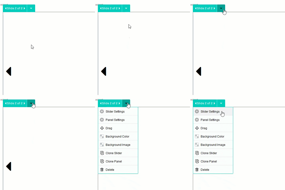
The Slider Settings popup will be displayed.
- Click on the Layout Properties tab.
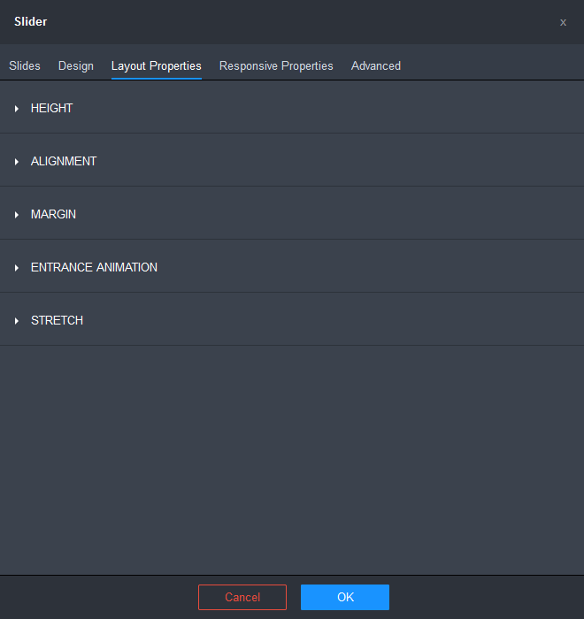
- Click on the HEIGHT section to expand it.
The Height settings will be displayed.
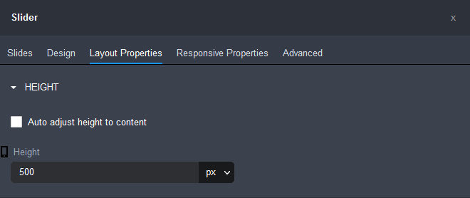
- Tick the Auto adjust height to content checkbox.
The Height field will become unavailable.

- Click OK.
To change the background color of a slide:
- Choose the slide you want to change the background of using one of the following:
- slide selector control at the top right of the slider widget
- scroll arrows at the sides of the slider widget
- slide selector buttons at the bottom of the slider widget
- Mouse over the Slider Widget.
The widget's controls will be displayed.
- Click on the down arrow beside the slide selector
- Choose the Background Color item from the drop-down menu.
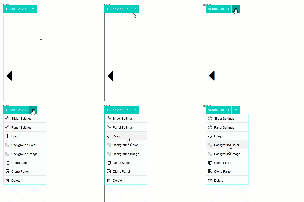
The Color popup will be displayed.
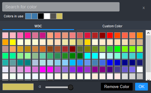
- Select a color. Click here for more detailed instructions on how to use the Color popup.
- Click OK.
To configure the Design settings for the Slider Widget:
- Mouse over the widget.
The widget's controls will be displayed.
- Click on the down arrow beside the slide selector control.
- Choose the Slider Settings item from the drop-down menu.

The Slider Settings popup will be displayed.
- Click on the Design tab.
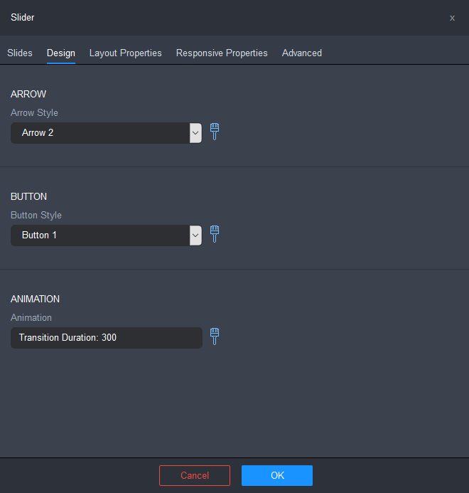
- Configure the design options for the Slider Widget.
ARROW
- Arrow Style: lets you choose and configure the style of scroll arrows displayed on the slider:
- No Arrows: does not display scroll arrows on the slider.
- Arrow 1 - 7: various style scroll arrows.
Click on the brush icon to configure the currently selected arrow style. The Arrow Style Settings popup is displayed.
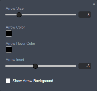
- Arrow Size: lets you set the size of the scroll arrows in pixels. Use the slider or enter a value between 0.0 and 30.0.
- Arrow Color: lets you set the color of the scroll arrows. Click on the color box to edit the arrow color using the Color popup. Click here for more detailed instructions.
- Arrow Hover Color: lets you set the color of the scroll arrows when the mouse pointer hovers over them. Click on the color box to edit the arrow hover color using the Color popup. Click here for more detailed instructions.
- Arrow Inset: lets you set the distance the arrow is inset from the side border of the slider container. Use the slider or enter a value between -30.0 and 30.0.
- Show Arrow Background: ticking this checkbox will display a background container for the arrow.
BUTTON
- Button Style: lets you choose and configure the style of slide selector buttons displayed at the bottom of the slider:
- No Buttons: does not display slide selector buttons on the slider.
- Button 1 - 6: various style slide selector buttons.
Click on the brush icon to configure the currently selected button style. The Button Style Settings popup is displayed.
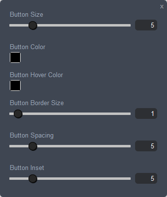
- Button Size: lets you set the size (uniform width and height) of the slide selector buttons in pixels. Use the slider or enter a value between 0.0 and 30.0.
- Button Color: lets you set the color of the slide selector buttons. Click on the color box to edit the button color using the Color popup. Click here for more detailed instructions.
- Button Hover Color: lets you set the color of the slide selector buttons when the mouse pointer hovers over them. Click on the color box to edit the arrow hover color using the Color popup. Click here for more detailed instructions.
- Button Border Size: lets you set the border line thickness of the slide selector buttons. Use the slider or enter a value between 0 and 30.0.
- Button Spacing: lets you set the spacing between the slide selector buttons. Use the slider or enter a value between 0 and 30.0.
- Button Inset: lets you set the distance the button is inset from the bottom border of the slider container. Use the slider or enter a value between 0 and 30.0.
ANIMATION
- Animation: displays the current setting duration setting for the transition from one slide to the next.
Click on the brush icon to display the Animation Settings popup which lets you configure the animation for the transition between slides.
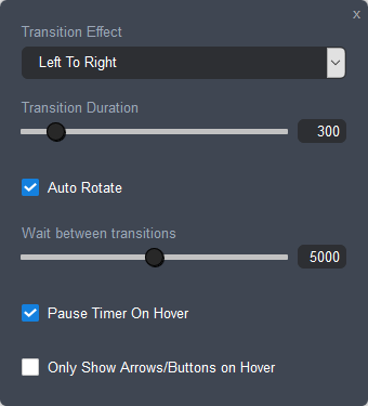
- Transition Effect: lets you choose the transition effect.
- Transition Duration: lets you specify the duration over which transitions should occur.
- Auto Rotate: will automatically rotate the slides.
- Wait between transitions: lets you specify the duration between transitions.
- Pause Timer On Hover: ticking this checkbox will pause the transition timer when the mouse pointer hovers over the slide.
- Only Show Arrows/Buttons on Hover: ticking this checkbox will display the scroll arrows and buttons only when the mouse pointer hovers over the slides.
- Arrow Style: lets you choose and configure the style of scroll arrows displayed on the slider:
- Click OK, once you have finished configuring the settings.
- Click on the Save button and then click on the Publish button at the right of the Page Settings Bar.
Comments
4 comments
How do we configure the silder to cover the whole width of the page?
Hi Felix,
You can configure the slider to cover to full width of the page using the Stretch option in the Layout tab of the Slider Settings. See this help article for instructions: Widget Settings - Layout Properties.
How can I add a link to a slide?
Hi Marco,
You can add a link to a slide by dragging an Image Widget onto a slide and specifying a link for the image in the Content tab of the Image Settings. See this help article for instructions: Image Widget.
Regards,
Lee
Please sign in to leave a comment.