The Shopping Cart Widget allows you to add a shopping cart to your website.
In this article, you will learn how...
- To add a Shopping Cart Widget to your website
- To configure the Design Settings for the Shopping Cart Widget
To add a Shopping Cart Widget to your website:
- Click on the WIDGETS button in the Website Editor Toolbar.
- Browse the Widgets tab to locate the Shopping Cart Widget in the BUSINESS section.
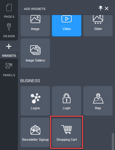
- Click and drag the Shopping Cart Widget onto your website page.
Allowable areas a Shopping Cart Widget can be inserted into include:
- Within rows
- Within columns
- Above or below existing widgets
The Shopping Cart Settings popup will be displayed.
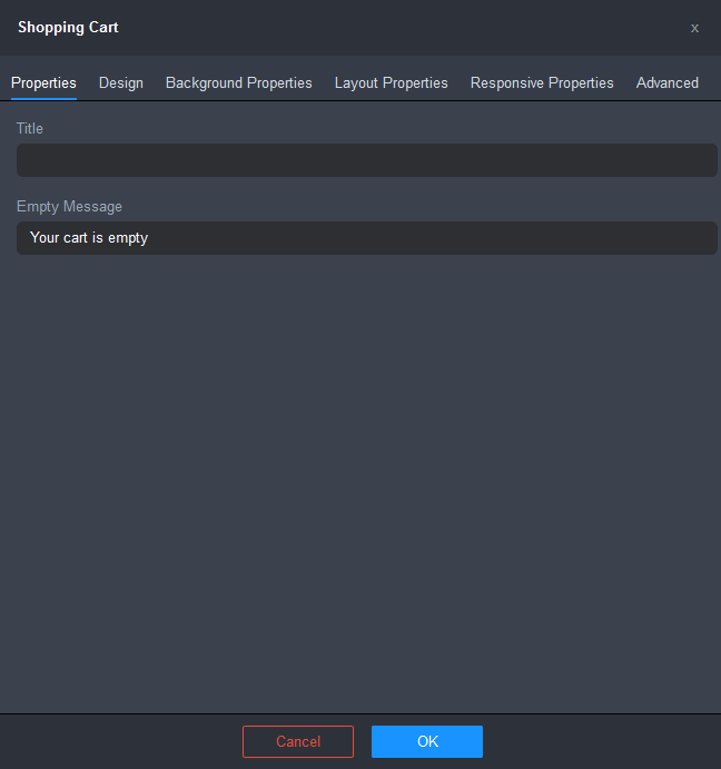
- Configure the settings for the Shopping Cart Widget.
- Title: lets you specify the title that will appear in the header area for the shopping cart panel.
- Empty Message: lets you specify the title that will appear when the shopping cart is empty.
- Click OK to apply the changes.
- Click on the Save button and then click on the Publish button at the right of the Page Settings Bar.
To configure the Design settings for the Shopping Cart Widget:
- Double-click on the Shopping Cart Widget.
- Click on the Design tab.
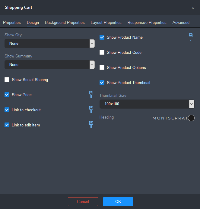
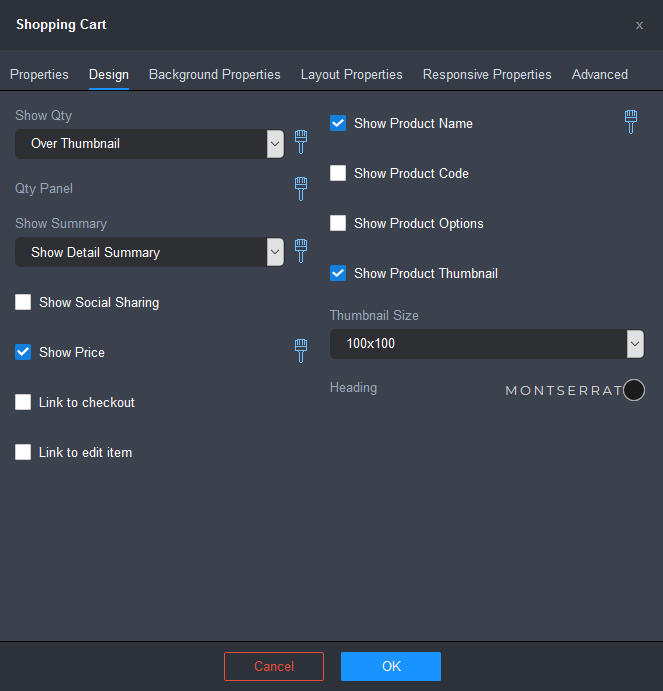
- Configure the Design settings as required.
- Show Qty: lets you choose an option for displaying the quantity ordered of each item in the cart:
- None: will not display the quantity ordered.
- Next to Thumbnail: will display the quantity ordered next to the product thumbnail, before the product name.
- Over Thumbnail: will display the quantity ordered over the top-right corner of the product thumbnail.
Click on the brush icon to configure the font style for the product code using the Font popup. Click here for instructions.
- Qty Panel (available only in the default Shopping Cart Widget on the Checkout Confirm system page): lets you configure the style settings of the indicator of the quantity ordered.
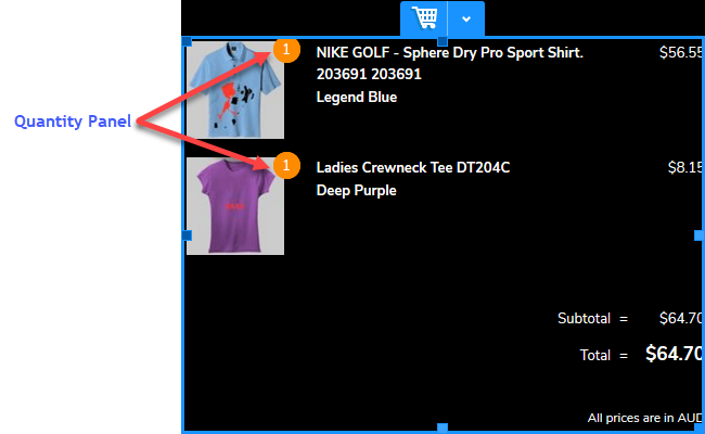
Click on the brush icon to configure the style settings for the quantity panel. The Settings popup for the quantity panel settings will be displayed.
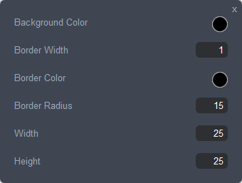
- Background Color: lets you background color of the quantity indicator panel.
- Border Width: lets you specify the line thickness of the quantity indicator in pixels. Enter a value between 0 and 20.
- Border Color: lets you specify the color of the quantity indicator's border. Click on the color spot to edit the border color using the Color popup. Click here for instructions.
- Border Radius: lets you specify the roundness of the corners of the quantity indicator's border in pixels. Enter a value between 0 and 100.
- Width: lets you specify the width of the quantity indicator panel in pixels. Enter a value between 5 and 50.
- Height: lets you specify the height of the quantity indicator panel in pixels. Enter a value between 5 and 50.
- Show Summary: lets you choose an option for displaying the shopping cart summary:
- None: will display not display the shopping cart summary.
- Show Simple Summary: will display a simple version of the shopping cart summary.
- Show Detail Summary: will display a detailed version of the shopping cart summary.
Click on the brush icon to configure the style settings for the detail summary. The Settings popup for the detail summary will be displayed.
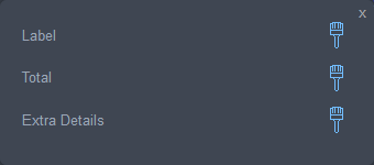
- label: lets you edit the style settings for the label.
Click on the brush icon to edit the style settings using the Font Popup. Click here for instructions.
- Total: lets you edit the style settings for the total.
Click on the brush icon style settings for the total. Click here for instructions.
- Extra Details: lets you edit the style settings for the extra details.
Click on the brush icon style settings for the extra details. Click here for instructions.
- label: lets you edit the style settings for the label.
- Show Social Sharing: when this checkbox is ticked, social sharing buttons will be shown for each item in the cart, allowing your customers to share the products they have purchased on their social media sites (i.e. Pinterest, Twitter, and Facebook) and via email.
- Show Price: when this checkbox is ticked, the product price will be shown for each item in the cart.
Click on the brush icon style settings for the price. Click here for instructions.
- Link to checkout: when this checkbox is ticked, a link will be available allowing your customers to check out.
Click on the brush icon to configure the style settings for the checkout link. The Settings popup for the checkout link will be displayed.
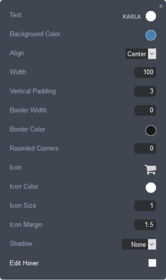
- Text: lets you edit the font style and the color of the text used in the checkout link.
- Click on the font name to edit the font style using the Font Popup. Click here for instructions.
- Click on the color spot to edit the text color using the Color popup. Click here for instructions.
- Background Color: lets you specify the background fill color of the checkout link. Click on the color spot to edit the background color using the Color popup. Click here for instructions.
- Align: lets you configure the horizontal alignment of the checkout link within the shopping cart.
- Width: lets you specify the width of the checkout link container as a percentage of the shopping cart container width.
- Vertical Padding: sets the height of the checkout link, using the em unit of measurement. An em is a value relative to the size of the font. Enter a value between 0.6 and 6. For example, 2em means 2 times the size of the font.
- Border Width: lets you specify the line thickness of the checkout link's border in pixels. Enter a value between 0 and 20.
- Border Color: lets you specify the color of the checkout link's border. Click on the color spot to edit the border color using the Color popup. Click here for instructions.
- Rounded corners: lets you specify the roundness of the corners of the checkout link's border in pixels. Enter a value between 0 and 100.
- Icon: lets you choose an icon for the checkout link. Click on the icon symbol to bring up the icon chooser popup.
- Icon Color: lets you set the color of the checkout link's icon. Click on the color spot to select a color using the Color popup. Click here for instructions.
- Icon Size: lets you specify the size of the checkout link's icon as a factor of the line height. Use the slider or enter a value between 0.3 and 4.
- Icon Margin: lets you specify the right margin of the icon as a factor of the line height. Use the slider or enter a value between 0.3 and 4.
- Shadow: sets the appearance of the shadow, if any, added to the checkout link.
- None: No shadow is displayed.
- On: Adds a consistent shadow around the entire border of the checkout link container.
- Custom: Lets you configure a custom shadow. Click here for instructions on how to configure a custom shadow.
- Edit Hover: lets you configure the appearance of the product code when you move the mouse over it. Tick the checkbox to enable the hover settings.
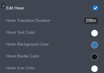
- Hover Transition Duration: sets the length of time, in milliseconds, over which the hover properties will occur. Enter a value between 0 and 2000.
- Hover Text Color: sets the color of the product code's text on hover.
- Hover Background Color: sets the background color of the product code on hover.
- Hover Border Color: sets the border color of the product code on hover.
- Hover Icon Color: sets the color of the product code's icon on hover.
- Text: lets you edit the font style and the color of the text used in the checkout link.
- Link to edit item: when this checkbox is ticked, an edit item link will be available, allowing your customers to edit the item.
Click on the brush icon to configure the font style for the edit link using the Font popup. Click here for instructions.
- Show Product Name: when this checkbox is ticked, the name of the product will be shown for items in the cart.
Click on the brush icon to configure the font style for the product name using the Font popup. Click here for instructions.
- Show Product Code: when this checkbox is ticked, the code of the product will be shown for items in the cart.
Click on the brush icon to configure the font style for the product code using the Font popup. Click here for instructions.
- Show Product Options: when this checkbox is ticked, chosen product options, such as size and color, will be shown for items in the cart.
Click on the brush icon to configure the font style for the product options using the Font popup. Click here for instructions.
- Show Product Thumbnail: when this checkbox is ticked, the product thumbnail will be shown for items in the cart.
- Thumbnail size lets you select the dimensions of the product thumbnail in pixels.
- Heading lets you configure the heading font and color.
Click here for instructions on how to edit the heading font.
Click on the color spot to edit the heading color. Click here for instructions on how to use the Color Popup.
- Show Qty: lets you choose an option for displaying the quantity ordered of each item in the cart:
- Click OK, once you have finished configuring the settings.
- Click on the Save button and then click on the Publish button at the right of the Page Settings Bar.
Comments
0 comments
Please sign in to leave a comment.