The default Products page displays a list of decorated products on your website that visitors can decorate and purchase. You can modify the appearance and content of the decorated product list by editing the Decorated Product Listing Widget settings.
In this article, you will learn how...
- To edit the properties of the default Decorated Product Listing Widget
- To configure the Design settings for the default Decorated Product Listing Widget
To edit the properties of the default Decorated Product Listing Widget:
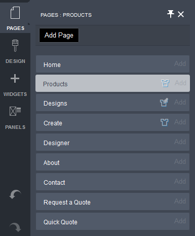
- Click on the PAGES button in the Website Editor Toolbar.
- Click on the Products page tab.
- Mouse over the Decorated Product Listing Widget on the Products page.
The widget's controls will be displayed.
- Click on the down arrow beside the Decorated Product Listing Widget icon.
- Choose the Decorated Product Listing Settings item from the drop-down menu.
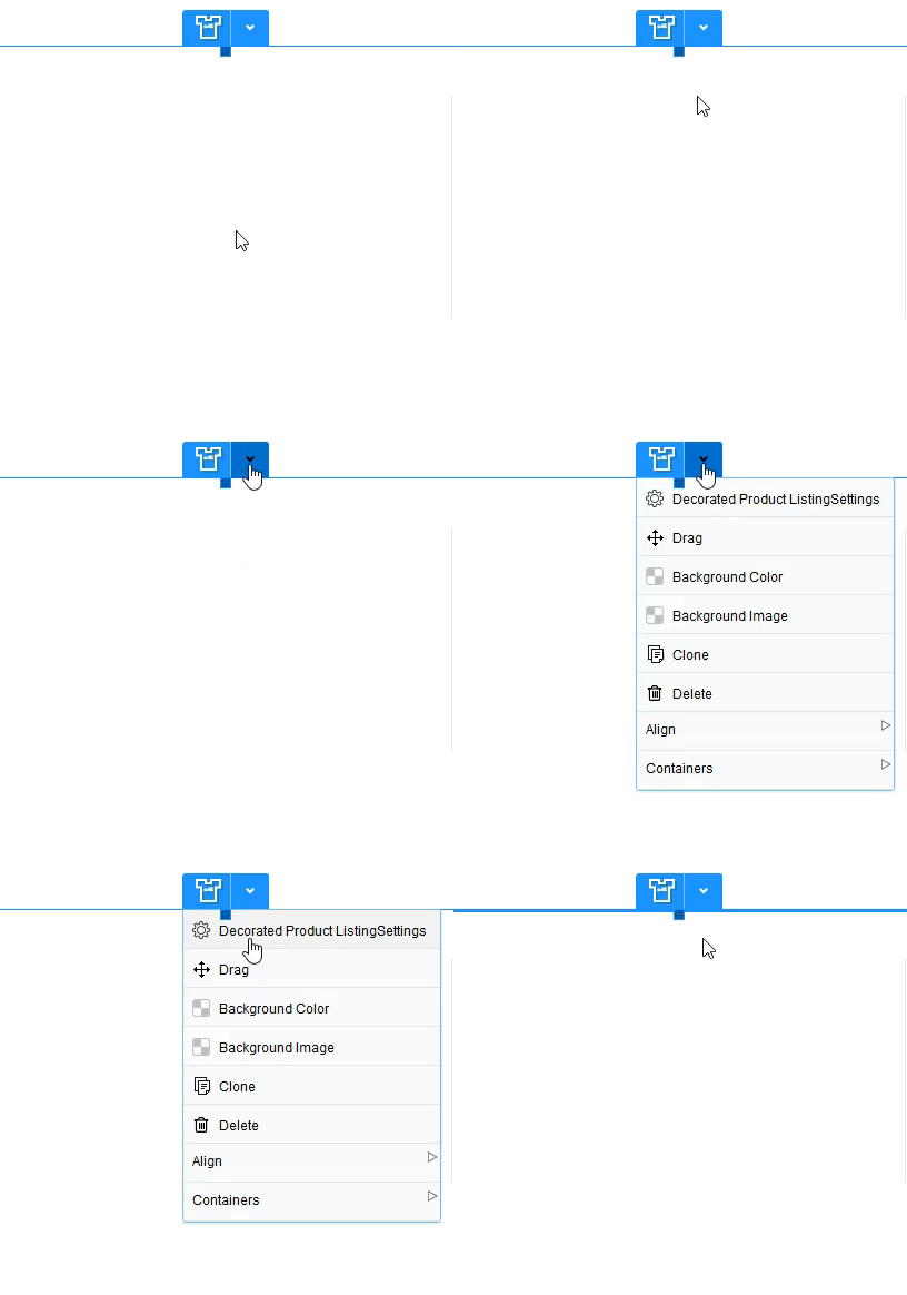
The Decorated Product Listing Settings popup will be displayed.
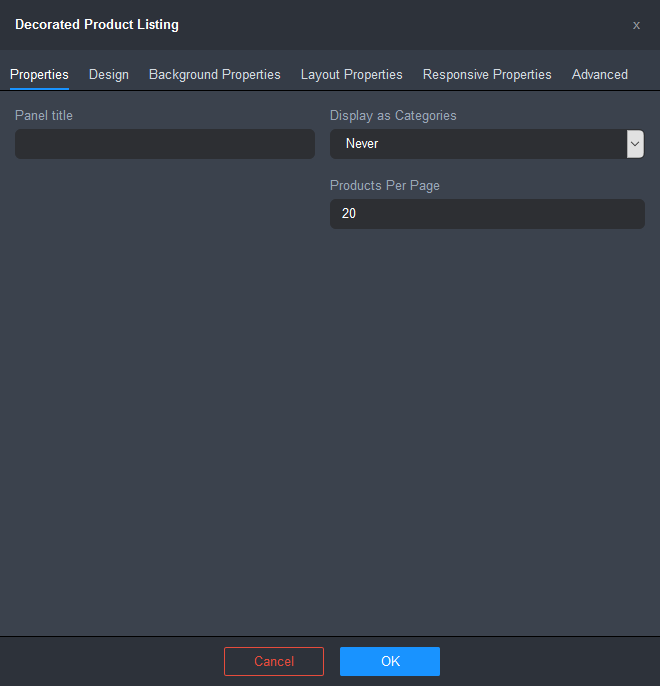
- Configure the Properties for the Decorated Product Listing Widget.
- Panel title: lets you specify the title that will appear in the header area for the design listing.
- Display as Categories: lets you choose whether to display the decorated product listing as categories instead of a flat listing.
- Never: displays all designs as a flat listing.
- Always: always displays the design listing as categories.
- Only on View All: displays the design listing as categories only when View All is selected.
- Products Per Page: lets you specify the number of products the listing will be limited to.
- Configure the Design settings for the Design Listing Widget. Click here for instructions.
- Click OK to apply the changes.
- Click on the Save button and then click on the Publish button at the right of the Page Settings Bar.
To configure the Design settings for the default Decorated Product Listing Widget:
- Click on the Design tab.
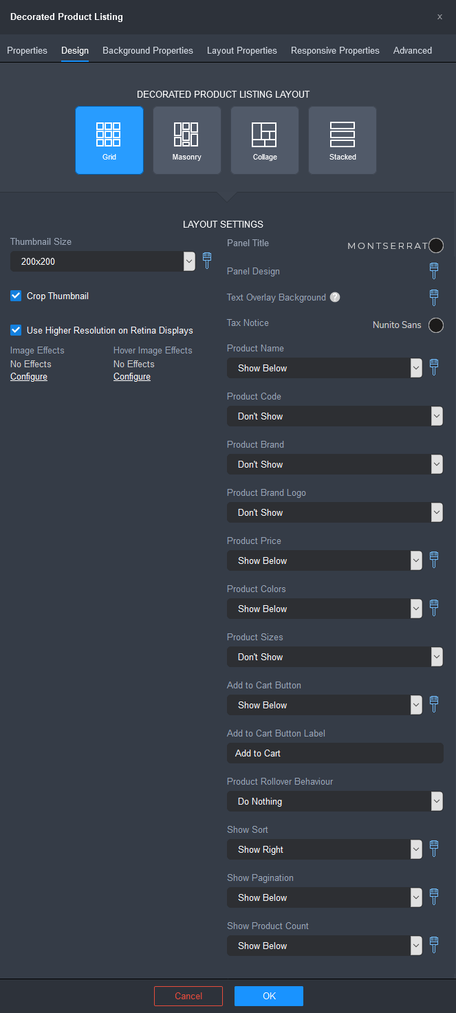
- Select from one of the pre-configured Decorated Product Listing Layout options:
- Grid: image thumbnails maintain their aspect ratio and are displayed in the center of each cell in a uniform grid arrangement.
- Masonry: image thumbnails are resized to have the same width while maintaining their aspect ratio and arranged to form equal columns. Images are placed in an optimal position based on available vertical space.
- Collage: image thumbnails maintain their aspect ratio, but are cropped and are placed in a pre-defined pattern arrangement of a specified number of items per row. You can set a 3,4,5, or 6 image pattern per row. Each row will use one of 4 pattern variations. If the last row has fewer items than necessary then the images will be arranged in a layout to ensure that all space is used on the final row.
- Stacked: image thumbnails maintain their aspect ratio and are displayed in a single column.
- Configure the rest of the design options for the Product Listing Widget.
- Thumbnail size: lets you set the dimensions of the product thumbnails. You can choose a preset size or choose Custom Size to specify a custom size.
The following fields will be displayed when you select Custom Size:
- Thumbnail Width: lets you specify the width of the product image thumbnail in pixels.
- Thumbnail Height: lets you specify the width of the product image thumbnail in pixels.
The maximum allowable thumbnail width and height is 600px. If a value higher than 600 is entered, the value will be automatically reset to 600. This is to prevent blurry thumbnail images caused by upscaling of the decorated product mockup images since they are generated at a maximum size of 600x600 pixels at the time of upload.
You can configure the container properties of the product thumbnails by clicking on the brush icon beside the Thumbnail Size field. The Thumbnail Properties popup will be displayed.

- Background Color: lets you specify the background fill color of the product thumbnail.
- Border Width: lets you specify the line thickness of the product thumbnail's border in pixels. Enter a value between 0 and 20.
- Border Color: lets you specify the color of the product thumbnail's border. Click on the color spot to edit the border color using the Color popup. Click here for instructions.
- Border Radius: lets you specify the roundness of the corners of the product thumbnail's border in pixels. Enter a value between 0 and 100.
- Use Higher Resolution on Retina Displays: when checked, will double the pixel density of the images to increase the clarity of the image for retina displays.
- Crop Thumbnail: crops the product image thumbnail to square when the checkbox is ticked. Leaves the image in its original shape when the checkbox is unticked.
- Image Effects: lets you apply filter and transform effects to the product images.
- Hover Image Effects: lets you apply filter effects, transform effects and hover animation to the product images for the hover state.
Click here for instructions on how to add image effects.
- Panel Title: lets you configure the font style and the color for the title that will appear in the header area of the product listing panel.
- Click on the font name to configure the font style using the Font popup. Click here for instructions.
- Click on the color spot to choose a text color using the Color popup. Click here for instructions.
- Panel Design: lets you configure the appearance of the panel containing the product listing.
Click on the brush icon to configure the panel design. The Panel Design popup will be displayed.
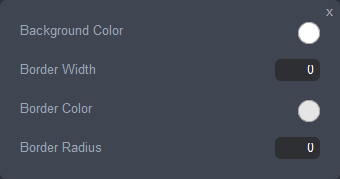
- Background Color: lets you specify the background fill color of the product listing panel. Click on the color spot to edit the background color using the Color popup. Click here for instructions.
- Border Width: lets you specify the line thickness of the product listing panel's border in pixels. Enter a value between 0 and 20.
- Border Color: lets you specify the color of the product listing panel's border. Click on the color spot to edit the border color using the Color popup. Click here for instructions.
- Border Radius: lets you specify the roundness of the corners of the product listing panel's border in pixels. Enter a value between 0 and 100.
- Text Overlay Background: lets you configure the background of any product information that is displayed on the product image or on image rollover.
Click on the brush icon to configure the text overlay background. The Text Overlay Background Properties popup will be displayed.

- Background Color: lets you specify the background fill color of the text overlay. Click on the color spot to edit the background color using the Color popup. Click here for instructions.
- Border Width: lets you specify the border line thickness of the text overlay background in pixels. Enter a value between 0 and 20.
- Border Color: lets you specify the border color of the text overlay background. Click on the color spot to edit the border color using the Color popup. Click here for instructions.
- Width: lets you specify the container width of the text overlay background as a percentage of the product thumbnail width.
- Align: lets you choose an alignment option for the text overlay in reference to the product image:
- Left: aligns the text overlay to the left of the product image.
- Center: centers the text overlay horizontally to the product image.
- Right: aligns the text overlay to the right of the product image.
- Tax Notice: lets you configure the font style, size, and color for the tax notice informing customers of the taxes that you collect. (Configure the tax notice via Admin > Settings > Taxes > Tax Settings).
- Click on the font name to configure the font style using the Font popup. Click here for instructions.
- Click on the color spot to choose a text color using the Color popup. Click here for instructions.
- Product Name: lets you choose an option for the display and placement of the product's name.
- Don't Show: does not show the product name.
- Show on Image: displays the product name across the middle of the product thumbnail.
- Show on Image on Rollover: displays the product name across the middle of the product thumbnail when the mouse hovers over the product thumbnail.
- Show Above: displays the product name above the center of the product thumbnail.
- Show Above on Rollover: displays the product name above the center of the product thumbnail when the mouse hovers over the blank product thumbnail.
- Show Below: displays the product name below the center of the product thumbnail.
- Show Below on Rollover: displays the product name below the center of the product thumbnail when the mouse hovers over the blank product thumbnail.
- Product Code: lets you choose an option for the display and placement of the product's code.
The display options are the same as for Product Name.
- Product Brand: lets you choose the position within the Decorated Product Listing container where the decorated product brand name will be displayed.
- Don't Show: does not show the product brand name.
- Show on Image: displays the product brand name across the middle of the product thumbnail.
- Show on Image on Rollover: displays the product brand name across the middle of the product thumbnail when the mouse hovers over the product thumbnail.
- Show Above: displays the product brand name above the center of the product thumbnail.
- Show Above on Rollover: displays the product brand name above the center of the product thumbnail when the mouse hovers over the decorated product thumbnail.
- Show Below: displays the product brand name below the center of the product thumbnail.
- Show Below on Rollover: displays the product brand name below the center of the product thumbnail when the mouse hovers over the decorated product thumbnail.
- Product Brand Logo: lets you choose the position within the Decorated Product Listing container where the decorated product brand logo will be displayed.
- Don't Show: does not show the product brand name.
- Show on Image: displays the product brand name across the middle of the product thumbnail.
- Show on Image on Rollover: displays the product brand name across the middle of the product thumbnail when the mouse hovers over the product thumbnail.
- Show Above: displays the product brand name above the center of the product thumbnail.
- Show Above on Rollover: displays the product brand name above the center of the product thumbnail when the mouse hovers over the decorated product thumbnail.
- Show Below: displays the product brand name below the center of the product thumbnail.
- Show Below on Rollover: displays the product brand name below the center of the product thumbnail when the mouse hovers over the decorated product thumbnail.
- Product Price: lets you choose an option for the display and placement of the product's price.
The display options are the same as for Product Name.
- Product Colors: lets you choose an option for the display and placement of the product's available colors palette.
Click on the brush icon to configure the product colors palette settings. The Text Product Colors Palette Settings popup will be displayed.
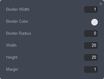
- Border Width: lets you specify the line thickness of a color's border in pixels. Enter a value between 0 and 20.
- Border Color: lets you specify the color of a color's border. Click on the color spot to edit the border color using the Color popup. Click here for instructions.
- Border Radius: lets you specify the roundness of the corners of a color's border in pixels. Enter a value between 0 and 100.
- Width: lets you specify the width of a palette color container in pixels. Enter a value between 5 and 50.
- Height: lets you specify the height of a palette color container in pixels. Enter a value between 5 and 50.
- Margin: lets you specify a uniform margin around a palette color container.
- Product Sizes: lets you choose an option for the display and placement of the product's available sizes.
The display options are the same as for Product Name.
- Add to Cart Button: lets you choose an option for the display and placement of the Add to Cart button for the product.
The display options are the same as for Product Name.
Click on the brush icon to configure the appearance of the Add to Cart button. (The brush will icon will not be displayed if "Don't Show" is selected). Style settings for the Add to Cart for a decorated product listing are the same as for theme button settings in the Style Editor. Click here for instructions on configuring the style settings for the button.
- Product Rollover Behavior: lets you choose the behavior when the mouse pointer hovers over the product thumbnail.
- Do Nothing: does not show a popup window displaying the product.
- Show Design: displays an enlarged view of the design in place of the product.
- Show Design in Popup: shows a popup window displaying an enlarged view of the product.
- Show Sort: lets you choose if/where the control for sorting the product listing is displayed.
- Don't Show: does not show the sort control.
- Show Left: displays the Sort control at the top left of the decorated product listing panel.
- Show Right: displays the Sort control at the top right of the decorated product listing panel.
Click on the brush icon to configure the sort control panel design. The Sort Panel Design popup will be displayed.
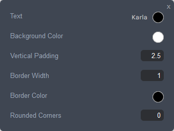
- Text: lets you edit the font style and the color of text used in the sort control.
- Click on the font name to edit the font style using the Font Popup. Click here for instructions.
- Click on the color spot to edit the text color using the Color popup. Click here for instructions.
- Background Color: lets you specify the background fill color of the sort control. Click on the color spot to edit the background color using the Color popup. Click here for instructions.
- Vertical Padding: sets the height of the sort control, using the em unit of measurement. An em is a value relative to the size of the font. Enter a value between 0.6 and 6. For example, 2em means 2 times the size of the font.
- Border Width: lets you specify the line thickness of the sort control's border in pixels. Enter a value between 0 and 20.
- Border Color: lets you specify the color of the sort control's border. Click on the color spot to edit the border color using the Color popup. Click here for instructions.
- Rounded corners: lets you specify the roundness of the corners of the sort control's border in pixels. Enter a value between 0 and 100.
- Show Pagination: lets you choose if/where the pagination controls for browsing through the product pages are displayed.
- Don't Show: does not show the pagination controls.
- Show Above: displays the Sort control at the top center of the decorated product listing panel.
- Show Below: displays the Sort control at the bottom center of the decorated product listing panel.
- Show Above and Below: displays the Sort control at the top and the bottom center of the decorated product listing panel.
Click on the brush icon to configure the style settings for the pagination control. The pagination settings popup will be displayed.
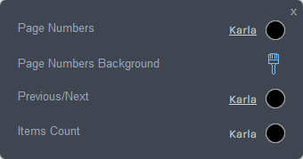
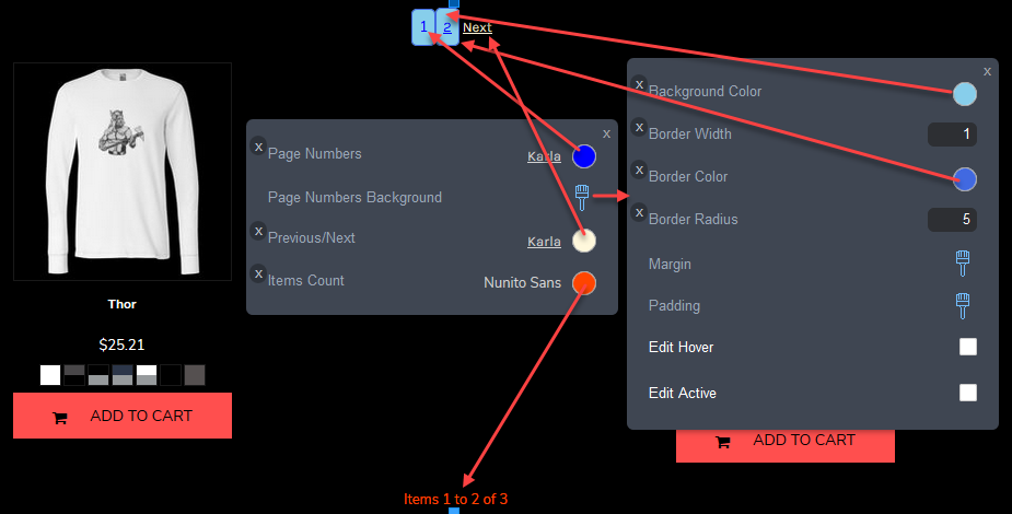
- Page Numbers: lets you edit the font style and the color of the page numbers in the pagination control.
- Page Numbers Background: lets you specify the background settings of the page number links in the pagination control.
Click on the brush icon to configure the background settings for page number links in the pagination control. The page numbers settings popup will be displayed.
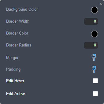
- Background Color: lets you specify the background fill color of the page number links. Click on the color spot to edit the background color using the Color popup. Click here for instructions.
- Border Width: lets you specify the line thickness of the border of the page number links in pixels. Enter a value between 0 and 20.
- Border Color: lets you specify the color of the border of the page number links. Click on the color spot to edit the border color using the Color popup. Click here for instructions.
- Border Radius: lets you specify the roundness of the corners of the border of the page number links. Enter a value between 0 and 100.
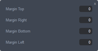
- Margin: sets the margin on each side of the number container (top, right, bottom, left). Click on the brush icon to access the margin settings.
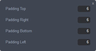
- Padding: sets the padding on each side of the number container (top, right, bottom, left). Click on the brush icon to access the padding settings.
- Edit Hover: lets you configure the appearance of the pagination number when you move the mouse over it. Tick the checkbox to enable the hover settings.
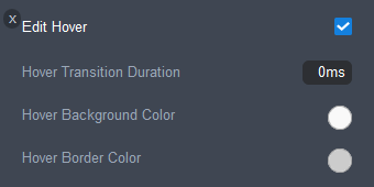
- Hover Transition Duration: sets the length of time, in milliseconds, over which the hover properties will occur. Enter a value between 0 and 2000.
- Hover Background Color: sets the background color of the pagination number on hover.
- Hover Border Color: sets the border color of the pagination number on hover.
- Edit Active: lets you configure the appearance of the pagination number when it is active. Tick the checkbox to enable the active settings.
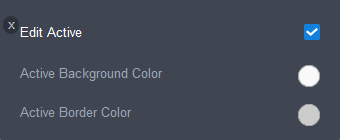
- Active Background Color: sets the background color of the pagination number when it is active.
- Active Border Color: sets the border color of the pagination number when it is active.
- Previous/Next: lets you edit the font style and the color of the Previous and Next links in the pagination control.
Click on the brush icon to configure the font settings for the Previous/Next link. Click here for instructions on how to configure the settings in the Font popup.
- Items Count: lets you edit the font style and the color of the Items Count in the pagination control.
Click on the brush icon to configure the font settings for the Items Count. Click here for instructions on how to configure the settings in the Font popup.
The following image shows what the pagination style settings apply to.
- Show Product Count: lets you choose if/where the product total and the number range of the products visible on the current page is displayed.
- Don't Show: does not show the product count.
- Show Above: displays the product count at the top center of the decorated product listing panel.
- Show Below: displays the product count at the bottom center of the decorated product listing panel.
- Show Above and Below: displays the product count at the top and the bottom center of the decorated product listing panel.
- Thumbnail size: lets you set the dimensions of the product thumbnails. You can choose a preset size or choose Custom Size to specify a custom size.
- Click OK, once you have finished configuring the settings.
- Click on the Save button and then click on the Publish button at the right of the Page Settings Bar.
Comments
0 comments
Please sign in to leave a comment.